Friday, March 1, 2013

What Is New In The Path2Design?

I have some awesome news! I was actually part of an article in the CM-Life newspaper involving my Design Bureau class! The article covers how we get to work with real clients in a classroom setting. Personally, I am working with three clients Solar Cycle Lights, Moore Hall TV, and New Central 34. Read the full article by following the link below.

CM-Life Design Article

Recently I decided to take some time to revise the Velo logo. This logo is for a business idea that I have in store, but still have a long way to go with building my web development skills before this business can move forward.


Below is a logo I worked on to show my appreciation of small businesses. This idea of #heartsmallbiz is a focus on the importance of small businesses being recognized in a local community. We are losing a sense of community with all of the corporate businesses leeching the profits and the entire idea of community away from the people. I hope to create an online community that will counteract this and give strength back into the idea of small businesses throughout our nation. You can show your love for small business by following the brand new Twitter account Heart Small Biz.

I also participated in a St. Patrick's day t-shirt contest for my Design Herd group. The idea was appropriated from the Lucky Charm's character with a couple mug's of beer in his hands to celebrate the Holiday.


In my Advanced Typography class we were assigned a unique assignment where we had to construct 3D type. The assignment was so broad that students have been scrambling to narrow down there ideas to one thing. One night I was at the library and happened to have my camera on me and the idea of creating the word "Face" out of library books would be a brilliant idea. I then went a step further and used books that only involved social media and the internet to give confused viewers an extra hint.


A few graphic design professionals came to CMU recently to speak to the designers on how to attract business, making the transition from school, building a portfolio, and considering making an online portfolio to increase exposure. Once I hone in my skills I will have a website up and running.

As for the latest news, I applied for a graphic design internship in LA through an internship program called "Dream Careers". The tuition is steep, but they provide you everything all inclusive. This includes housing, commuting to work, meals, facilities, speaking events, and other events. Everything is located at the UCLA campus and as a student of the program you are allowed to have access to the UCLA facilities. It also provides school credits and a 100% guarantee for an internship of your choice with some of the top companies like (Yahoo, MTV, Millennium Films, etc). They also provide other internships throughout the U.S. and even outside of the U.S. as well. I decided to apply to the LA program because it seemed to be the most suitable to my interests as a graphic designer. Working for an entertainment agency would literally be a nice taste of a dream career. So if you are interested in finding an internship that is catered to you, the ability to network with other interns, and make your experience more accommodating to the transition into a real life work situation then this might be a great opportunity to check out. The website to get there is is summerinternships.com.


If you are a student graphic designer and have any questions about building a portfolio, how to get into the graphic design program at your school, networking, finding tutorial websites, specific questions about my projects, or any other general advice I would gladly help you out. Please leave comments and suggestions as well because I will be happy to hear your advice as I continue this journey on the Path2Design.


Thursday, January 24, 2013

The Art of Simplicity


Today as some of you may know is my birthday. I am now 22 years old, so that means all of the fun birthdays are over and now I get to look forward to lower insurance rates as I move forward in life. That is okay though, I have already been dedicating my time into a new kind of fun, Graphic Design! This may come off as completely nerdy, but I'm okay with that, I found something I love to do!

Since I began learning graphic design in 2011 I have been constantly hearing, reading, and seeing a key concept of design. This key concept is simplicity. I use to think that simplicity was for the lazy designers that didn't want to make an effort in creating a worthwhile design. Boy was I ever wrong about that. The use of minimalism can be one of the most time consuming forms of design. Designers (for branding) create sketch after sketch of different designs attempting to make the most visual appealing, easy to recognize, unique, and relate-able design concept to fit the company. 

Any design can take weeks of research depending on the company or product for it to be an effective design that a consumer can relate to. Some of the more recent books that I've read which all view simplistic designs similarly are 


Logo Design Love (pictured above), Recycling & Redesigning Logos, and How to become a Graphic Designer without Losing Your Soul.

If you look at any of the "big name" companies out there you will notice that they all have simple and iconic designs. The reason main reason is that it can be easily identifiable for the consumer even when the consumer is whizzing by in a vehicle. I use to try to cram everything I could into a design because I wanted to show off my creativity. In many cases its okay to allow yourself to go creatively wild like I did on My Twitter background, but in other cases keeping it clean and simple can create the most effect outcome. 

I recently joined a new website called Behance which allows an designer, photographer, animator, advertiser, and basically any creative person to create a portfolio for free! I have been looking at so many portfolios and getting some great ideas from all of the professionals out there!

Also, if you are a design professional, a couple of the groups I have been involved with since October may interest you as well. I am part of the West Michigan AIGA  and the MMCA (Mid-Michigan Creative Alliance). If you aren't from Michigan, there are AIGA chapters all throughout the U.S. so you can find your local chapter at AIGA . 

All of these websites provide great portfolios to view, creative events, job listings, forums, etc. The design world is growing and is becoming more and more connected as we progress in the future.


Saturday, January 19, 2013

Manti Te'o on Catfish the MTV TV Show?


Having an exclusive story with Manti Te'o is a great idea, but unfortunately this flyer is just as fake as Manti's girflfriend. I made this advertisement simply for fun this weekend after hearing this controversy drowning the news. Taking a break from TV was a must, so a creative design was in order.

The software program I used to create this advertisement was:

Adobe Photoshop CS6


In creating this advertisement, I appropriated the catfish logo, MTV symbol, and the largest image of Manti Te'o that I could find.  Manti Te'o's body was removed from its background using the "Quick Selection" Tool, while the other two images were removed from their backgrounds by using the "Magic Wand" Tool. Catfish barbels, also known as whiskers, were added to spice up the satire of the advertisement and then a Luminosity effect was given to the image for its final touch.


Who knows, maybe this advertisement will become viral enough to get to  MTV's Catfish and can work out a deal with Manti Te'o. I think this controversy and The Catfish TV show blend together really well and the people on the TV Show can relate to Manti's embarrassing experience.


Sunday, January 13, 2013

The Graphic Design Program Begins

The spring semester at CMU has begin and this marks the first semester that I have been able to take classes that are only allowed for students who have been accepted into the program. The classes on my schedule are:

- Intro to Western Art II

- Aesthetics

- Introduction to Graphic Arts

- Design Bureau*

- Advanced Typography*

The classes with the (*) are the Graphic Design major only classes. The introduction to Graphic Arts is for my Media, Design, Production, and Technology minor, but I think it will have some similarities to the Intro to Graphic Design class that I completed three semesters ago.

Design Bureau is going to be my favorite class because this class consists of dealing with actual clients. My professor is organizing our clients and then depending on how many clients we have, we will be split into groups or work individually. When conversing with my peers, there apparently have been some horror stories in the past with clients that have been very disobedient, ungrateful, and ultimately problematic. I see this as just being part of the challenge and it is simply business. The edge I have in this situation is that I was originally a business major so I have background knowledge on how to orchestrate a business meeting. I was also a salesman for Sears and for Cutco which has its extra benefits.

In this class the required textbook is "How to be a graphic designer, without losing your soul" by Adrian Shaughnessy.

How To Be A Graphic Designer, Without Losing Your Soul

I began reading this book today and I am already excited about sharing it with you.

Another book that I have been reading and would like to recommend to you is called "Logo Design Love" by David Airey. The title of the book is a giveaway, it obviously about logos, but it will give you an insight for any of you logo lovers out there or for those who wish to become one.

Logo Design Love


Advanced Typography will be a fun, but challenging class because of its intensity with type usage. I have often noticed that it has been tough to find a certain type choice for a specific project with a plethora of type options available. As I have been told, I will eventually figure out my favorite typefaces to apply to my style of design.

One of my major struggles is finding my style. I know that when you think of a specific designer or artist you will know their certain style. When I think of myself, I have no style to identify with but I'd rather learn everything I can because I do not want to be limited. This ideology of wanting to learn it all limits the ability to fine tune a specific style because the time consumed by other styles interfere with expanded my knowledge on the other. I think this is the point where a lot of college students are at, which is the stage of experimentation.

Learning all of these new things are exciting, but they are also overwhelming when you are trying to learn them all at once. This semester I am going to apply a tactic that I have learned from a couple of motivational speakers that I have been listening to on my iPad. I learned the tactic of goal setting in a unique way. Instead of cramming all of my goals together, getting overwhelmed, and then ending up getting rarely anything done, I am going set individual goals one at a time. I will not move forward to the next goal until I have mastered the previous goal (this only applies to projects outside of school work). Once everything is ironed out between school and side projects with this new goal setting routine, then this semester should be smooth sailing.

If you're a Graphic Design student and you are reading this, one tip I can give to you is don't be limited by what your professors teach you in school. Go out and learn everything you can on your own. You will learn so much more in addition to what you learn in school. Just don't get overwhelmed by it and learn at your own pace. I guess I'll add an additional tip. This world is becoming more and more interconnected so learn skills other than just graphic design because that will give you the edge against the competition and may be required for your jobs in the future.

Monday, November 26, 2012

Cyber Monday Craziness! Christmas List and the Future

It seems to me that each year Cyber Monday has a stronger and stronger impact on holiday shopping. Malls and other retail stores won't go out of business because they are too convenient, but I am sure one of the reasons for starting Black Friday at midnight (in my town) was one of their ways to combat the overwhelming market moving toward the internet to buy their holiday gifts so they won't have to wait in those dreadful lines. The stores were packed at first, but around 3 a.m. they had cleared up which made me a fairly happy customer at Rivertown Crossings Mall in Grandville, MI.

Even though I think the local retail stores did a good job in combating with the long lines that people hate in order to draw customers, I think the online holiday purchases will grow this year. With that said, I am happy to know that my career choice in college is technology based. Lately, I've been diversifying my skills by tapping into coding with HTML, CSS, PHP, and Java so I will know the development side along with the artistic side of design.

Recently I created two websites. One website was for school and the other is my personal website to show a gallery of my works and for potential employers and customers to get in touch with me. The intention of my website for school was to create an online cookbook. I decided to create mine with a twist. I made the website into more of a contest for college students to win gifts cards by submitting their recipes that could be featured for a week.

The website can be found through school by going to  Simple College Eats Website .

Although my personal website is a long way from complete, I have been enjoying learning new techniques as I go. The aesthetics of the website work, but as I have been reading more and observing professional websites, I realize that gradients and the use of shadows in the contents of my webpage look unprofessional. I'll be changing the website around soon, so you may see a different website in the near future. The link to my online portfolio (personal website) is Andrew Russo Designs Website .


As I have been using Adobe Dreamweaver and can confirm to you that this software is truly a useful tool. I am fairly new to developing, so for us "newbies" Dreamweaver is beneficial. I'm sure it has it great benefits for advanced users as while, so I will let you know when I'm caught up to that point or you can comment below to fill us in. The software undoubtedly helps me keep organized with my code. When I first started, I had a knack for string all of the code together and finding myself lost in it.


Reverting back to Cyber Monday, I of course did my research and found three things that I will be putting on my Christmas List this year. Now that I am advancing skills in design and dipping my toes into development, I am looking forward to start creating an e-commerce website where I can sell t-shirts with graphics screen printed onto them. This would be a hobby on the side that I would do on my spare time. With that said, I was checking out new printing equipment to print positives for screen printing.  I watched a few tutorials and found Cat Spit Productions to be the most insightful. The screen printer I am looking for would be something small for personal use and I happened to find one just like it at Hobby Lobby.  It was called a Speedball screen printer. Since I have no experience with the product, I can't provide you with any detail on its quality, but from watching the YouTube video above you can see for yourself its potential.

The next thing I came across when I was shopping at Best Buy were Epson printers. I knew that if I ever want to make quality screen printed t-shirts and any quality designs for customers or school then I need to get a quality printer. The students at CMU have printers provided for them, but the cost to print  is extremely expensive at over $3 per print for an 8.5" x 11" print no matter how much ink is used. I have probably spent enough money to buy a quality printer at that cost. Another reason for purchasing my  own quality printer would be for if I ever begin to get an increased traffic flow of t-shirt purchases.

As a beginning designer living in a rather small apartment I'd definitely choose one of these two options to kick things into gear:


The printer above is the Epson Artisan 730 Color Inkjet All-in-One and from the high reviews I think it would be a designer or even photographer that is running a small business or needs to produce quality work for school projects. It also has wireless capabilities which would be amazing because I like to move around the area and could print from anywhere on a smart phone, tablet, and of course on my lap top.


This next printer is the Epson Artisan 837 and is my personal favorite. The major differences that suck me in are that the LCD screen is bigger and that it can print rather fast but still holds its quality from the video reviews I watched. We all have those last minute projects that need to be completed so it that could definitely come in handy. It is also wireless and has a scanner like the printer above.


Lastly, during my perusing through the ads today, I came across this awesome stylus for the tablet
called the Sensu Brush. It is literally a paintbrush that works on a tablet. It also has a normal stylus pen that you can flip around for drawing.

"The rubber stylus is exposed when the brush is closed. This stylus is great for sketching and writing or as a general navigation tool. Grasp Sensu near the nib section and pull it out of the protective cap. You will reveal the capacitive bristles of the artist brush. Insert the rubber stylus into the cap and the cap becomes a handle for your brush." - SensuBrush.com


Check Out The Sensu Brush For Yourself!

As for my current projects, I am working on an animation for school and for a ficticious raincoat company called "Rubber's Raincoats". You can check out the poster I've created so far on the images section of my Twitter. Check Out My Twitter .

Feel free to follow me and or contact me at anytime! Take care everyone.


Wednesday, November 14, 2012

Graphic Design BFA Acceptance!

I had forgotten to say that I finally got accepted into the graphic design program at Central Michigan University! Next semester I am officially taking a few classes that only Graphic Design majors are allowed to take. I'm very excited and am looking forward to acquiring new skills to become a professional graphic designer. Along with that, I am also pursuing the MDPT (Media, Design, Production, and Technology) minor. Aside from enjoying learning to build websites in CPS 165 and learning Adobe Flash in CPS 282, I am taking those classes for the minor.

I would really like to find and internship this summer to get a feel of what it's like to be a design professional, so if you know of any companies that are looking for help with graphic design please let me know!


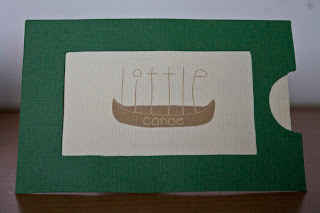
Little Canoe

I recently received my personal logo assignment back and wanted to show you all my creative idea I had for a design business called Little Canoe. I spent a lot of time trying to come up with the right logo and the logo that seemed to make the most sense was the hand drawn logo of Little Canoe. I decided to hand craft the business card to make it unique in its own way. I designed a picture frame using Adobe Illustrator CS6 and then cut each individual piece out and glued the pieces of the frame together with Scotch Quick-Drying Tacky Glue which actually worked out very well!

I used Photoshop to create the QR code within the picture frame. Just in case the business card is ever lost, the customer can still contact the company by scanning the QR code which brings the customer directly to the Little Canoe website.

Check out some photographs:


This is just one of the many projects I have been working on throughout the semester.

In my CPS 165 (Intro to Modern Website Design) class, I have created three websites. We were only allowed to use Notepad (Windows) or TextEdit (Mac) and couldn't use Adobe programs for anything besides the background.


I hope you like what I have done so far! Please feel free to leave any questions or comments!