Hey everyone! I've been pretty busy with projects and they are all piling up in within these last two weeks of school. Spring break is just over a week away, so it will be nice to catch a break from the constant projects that I've had to do even though I've enjoyed almost all of them. Unfortunately I'm not going anywhere for spring break this semester, but I guess I pretty much had a four month break while working in Orlando, FL at Walt Disney World last year so I guess it compensates.
Now for some updates. I was told yesterday by my 3D Design professor that my wire moose project was going to be in an upcoming art show so that is definitely exciting news! Also I have three projects completed for my Graphic Design class, one project from my Color & Composition class, and one project from my Photography class that you can look at below. I am currently working on another Photography project that I'll be completing on Saturday with the help of some friends from my hometown in Grand Rapids (I'll show you a couple of samples). I am also working on a Color & Composition project involving graphs and implementing a design relation to the content within them.


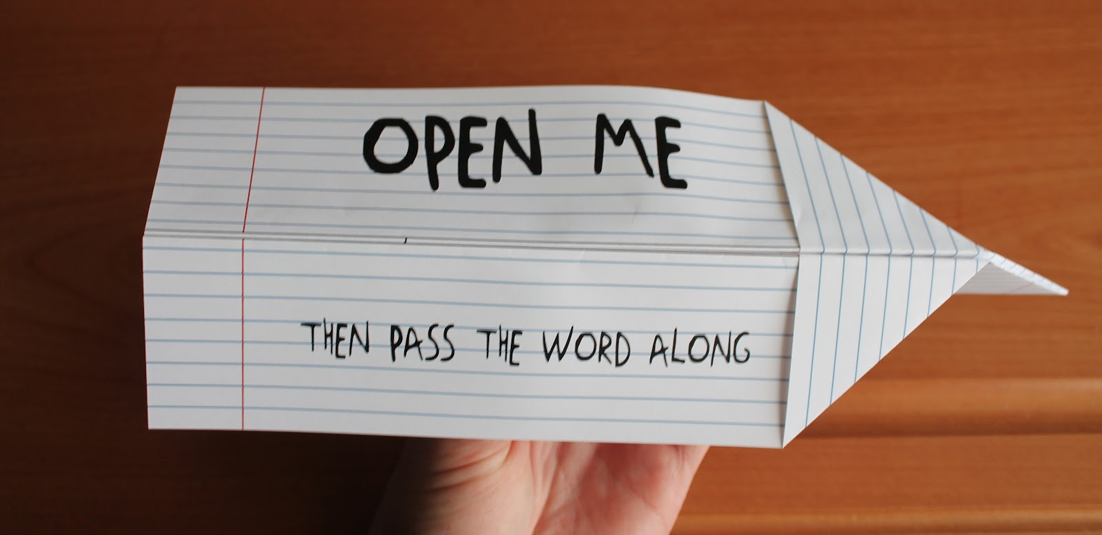
The photographs above display a flyer for the Air Zoo which is an actual Aviation Museum. The target market for this flyer was children and to make it interactive (making the flyer actually fly). For the target market I chose to create a simple design so it would be suitable for children. My goal was to design an easy to make airplane that resembled the notes kids would pass to each other back in elementary school. I didn't display any information on the outside of the flyer that would give away the "secret" of what was inside, so it would make the viewer more curious to look at what was inside. I created a paper-like style to the outside of the plane, but I abstracted it so it wouldn't look exactly just like a piece of paper.

This poster design was created for my Color & Composition class. This is a poster ad design of a concert held by Eric Church which is an actual concert that is happening tonight at the Kellogg Arena. During the critique I was told that this definitely represents country, but the style is a bit timid for Eric Church. Personally I think this works for a majority of his songs, but I should have something different because I reference the song "Drink In My Hand" for the class which gave him more of a "hardcore bad ass" approach. I just picked that song because its one of my favorites as of recently and I had not considered the relation between the poster and the song. I should have presented "A Lot of Boot Left to Fill", "Love Your Love the Most", etc. I guess ya live and learn haha. Oh and I created everything in this picture including the photograph which was taken in Mt. Pleasant, MI.


This is a letter head, business card, and envelope of a fake company that my professor gave us. Below is the scenario:
"Sixteen years ago a few friends in Minneapolis MN decided to open up a music instrument store, specializing vintage rock guitars. The named the store “Frets”. The first year of business was deadly slow, they barley broke even, but after a few years it started to explode. And soon they were expanding. Now they have ten stores and are looking to add three more. With this expansion they need an updated look and feel. You have been hired to create a new logo, and apply that to business cards, letterheads and envelopes."
*All photographs were taken in Mt. Pleasant, MI
These Photographs above are called Diptychs. Which are two photographs displayed side by side that relate to one another. My teacher made us draw a topic and we had to go out into the world and create diptychs that related to the topics we drew. The topic I drew was "change", so I had a little fun with it. I ended up choosing the first photograph because I thought it would be fun to use the topic literally and metaphorically. The photo is literally change, but it contains a metaphor of change over time from segregation into integration of our society. The nickels, dimes, quarters represent Caucasian's and the pennies represent African Americans (whites & blacks). I flipped the top picture upside down to give the impression as if the change would fall into the picture below creating the circular world-like shape of integrated change.


The pictures above are from the Photography 140 project that I'm currently working on. The objective for this project is to capture movement using light art and freezing images. These are a few images that I liked, but I have to redo most of the others this weekend.
Above was a presentation that was happening in the art building during my photography class and we had the opportunity to check it out. From what I was told, the class was melting metal. This gave me a good opportunity to add a few extra photos to my capturing movement project.
I feel that my projects turned out well. I am continuing to work on my presentation skills so I can give a better sell to my designs. Its a work in progress, but I am starting to get better as time continues on.
That is all for now. Have an awesome spring break everyone!