Showing posts with label logo. Show all posts

Thursday, January 24, 2013

The Art of Simplicity


Today as some of you may know is my birthday. I am now 22 years old, so that means all of the fun birthdays are over and now I get to look forward to lower insurance rates as I move forward in life. That is okay though, I have already been dedicating my time into a new kind of fun, Graphic Design! This may come off as completely nerdy, but I'm okay with that, I found something I love to do!

Since I began learning graphic design in 2011 I have been constantly hearing, reading, and seeing a key concept of design. This key concept is simplicity. I use to think that simplicity was for the lazy designers that didn't want to make an effort in creating a worthwhile design. Boy was I ever wrong about that. The use of minimalism can be one of the most time consuming forms of design. Designers (for branding) create sketch after sketch of different designs attempting to make the most visual appealing, easy to recognize, unique, and relate-able design concept to fit the company. 

Any design can take weeks of research depending on the company or product for it to be an effective design that a consumer can relate to. Some of the more recent books that I've read which all view simplistic designs similarly are 


Logo Design Love (pictured above), Recycling & Redesigning Logos, and How to become a Graphic Designer without Losing Your Soul.

If you look at any of the "big name" companies out there you will notice that they all have simple and iconic designs. The reason main reason is that it can be easily identifiable for the consumer even when the consumer is whizzing by in a vehicle. I use to try to cram everything I could into a design because I wanted to show off my creativity. In many cases its okay to allow yourself to go creatively wild like I did on My Twitter background, but in other cases keeping it clean and simple can create the most effect outcome. 

I recently joined a new website called Behance which allows an designer, photographer, animator, advertiser, and basically any creative person to create a portfolio for free! I have been looking at so many portfolios and getting some great ideas from all of the professionals out there!

Also, if you are a design professional, a couple of the groups I have been involved with since October may interest you as well. I am part of the West Michigan AIGA  and the MMCA (Mid-Michigan Creative Alliance). If you aren't from Michigan, there are AIGA chapters all throughout the U.S. so you can find your local chapter at AIGA . 

All of these websites provide great portfolios to view, creative events, job listings, forums, etc. The design world is growing and is becoming more and more connected as we progress in the future.


Sunday, January 13, 2013

The Graphic Design Program Begins

The spring semester at CMU has begin and this marks the first semester that I have been able to take classes that are only allowed for students who have been accepted into the program. The classes on my schedule are:

- Intro to Western Art II

- Aesthetics

- Introduction to Graphic Arts

- Design Bureau*

- Advanced Typography*

The classes with the (*) are the Graphic Design major only classes. The introduction to Graphic Arts is for my Media, Design, Production, and Technology minor, but I think it will have some similarities to the Intro to Graphic Design class that I completed three semesters ago.

Design Bureau is going to be my favorite class because this class consists of dealing with actual clients. My professor is organizing our clients and then depending on how many clients we have, we will be split into groups or work individually. When conversing with my peers, there apparently have been some horror stories in the past with clients that have been very disobedient, ungrateful, and ultimately problematic. I see this as just being part of the challenge and it is simply business. The edge I have in this situation is that I was originally a business major so I have background knowledge on how to orchestrate a business meeting. I was also a salesman for Sears and for Cutco which has its extra benefits.

In this class the required textbook is "How to be a graphic designer, without losing your soul" by Adrian Shaughnessy.

How To Be A Graphic Designer, Without Losing Your Soul

I began reading this book today and I am already excited about sharing it with you.

Another book that I have been reading and would like to recommend to you is called "Logo Design Love" by David Airey. The title of the book is a giveaway, it obviously about logos, but it will give you an insight for any of you logo lovers out there or for those who wish to become one.

Logo Design Love


Advanced Typography will be a fun, but challenging class because of its intensity with type usage. I have often noticed that it has been tough to find a certain type choice for a specific project with a plethora of type options available. As I have been told, I will eventually figure out my favorite typefaces to apply to my style of design.

One of my major struggles is finding my style. I know that when you think of a specific designer or artist you will know their certain style. When I think of myself, I have no style to identify with but I'd rather learn everything I can because I do not want to be limited. This ideology of wanting to learn it all limits the ability to fine tune a specific style because the time consumed by other styles interfere with expanded my knowledge on the other. I think this is the point where a lot of college students are at, which is the stage of experimentation.

Learning all of these new things are exciting, but they are also overwhelming when you are trying to learn them all at once. This semester I am going to apply a tactic that I have learned from a couple of motivational speakers that I have been listening to on my iPad. I learned the tactic of goal setting in a unique way. Instead of cramming all of my goals together, getting overwhelmed, and then ending up getting rarely anything done, I am going set individual goals one at a time. I will not move forward to the next goal until I have mastered the previous goal (this only applies to projects outside of school work). Once everything is ironed out between school and side projects with this new goal setting routine, then this semester should be smooth sailing.

If you're a Graphic Design student and you are reading this, one tip I can give to you is don't be limited by what your professors teach you in school. Go out and learn everything you can on your own. You will learn so much more in addition to what you learn in school. Just don't get overwhelmed by it and learn at your own pace. I guess I'll add an additional tip. This world is becoming more and more interconnected so learn skills other than just graphic design because that will give you the edge against the competition and may be required for your jobs in the future.

Wednesday, October 3, 2012

There Are No Brakes In The Car of Life

There is so much to tell you! But before I do I just want to say something in addition to the title that you read above. Even though there may be no brakes in the car of life, as long as you hold your head high, the road will continue on so you will never crash and burn. Enough with the motivational speech and time to catch you up. Where have I been since mid-September you may be asking? Well, I have been attached at the hip with my laptop because I decided at the last minute that I was going to build my Graphic Design portfolio for this semester rather than in the spring. I finally completed it on Monday and turned it in on Tuesday which was only one day before the deadline. I have been so busy that I haven't even had time to manage my fantasy football team. I feel like I'm letting those guys down! All kidding aside, it really has been crunch time lately between the projects, exams, homework, quizzes, and a majority of the time devoted to building my portfolio.

The contents required for my Graphic Design portfolio for the Central Michigan University Graphic Design program:

*A written form showing the grades I had in a few Art classes and included my signature
*One page essay of the reason why I wanted to become a Graphic Designer
*10 projects
*10 descriptions

Brownie Points (hopefully):

*Added a cover on the front of my portfolio that matched that basic design for the descriptions
*Laminated every page to give it a professional look
* For some of the designs I provided thumbnails for an easier viewing and to make my project flow more smoothly

Below is my portfolio from cover to finish:


That completes my portfolio! I hope you like it! I had to leave a couple parts of it out, but it shows all ten of my designs that I submitted for the program. Wish me luck!


This next piece below is one from my typography class. I decided to design the Ray Ban wayfarer sunglasses out of type. All of the type inside the image is about the history of the Ray Ban company and how it has been a significant part of our society's style for many years.


This piece below was created for my Art 117 (Intro to Contemporary Issues) class. It was created to match the similar style of David Hockney. It displays the style use of time and motion to represent what the human eye experiences in an event over a period of time. This particular project was created to represent a night of fun between college friends and capture the energy throughout the night. 


Below are a few logos that I am working on for my personal logo. These are for my Logo & Identity course where I have to create a business card, letterhead and envelop. If you have any suggestions I'm open to hearing any of them.


Well there you have it! These project are what I have been devoting the first portion of my semester to. Feel free to comment and share your knowledge with me to help me in the process of becoming a Graphic Designer. That also goes both ways, I'd be happy to help you if you are need of any advice on project ideas too.

Thursday, February 23, 2012

Spring Break Is Just A Week Away!!!

Hey everyone! I've been pretty busy with projects and they are all piling up in within these last two weeks of school. Spring break is just over a week away, so it will be nice to catch a break from the constant projects that I've had to do even though I've enjoyed almost all of them. Unfortunately I'm not going anywhere for spring break this semester, but I guess I pretty much had a four month break while working in Orlando, FL at Walt Disney World last year so I guess it compensates.

Now for some updates. I was told yesterday by my 3D Design professor that my wire moose project was going to be in an upcoming art show so that is definitely exciting news! Also I have three projects completed for my Graphic Design class, one project from my Color & Composition class, and one project from my Photography class that you can look at below. I am currently working on another Photography project that I'll be completing on Saturday with the help of some friends from my hometown in Grand Rapids (I'll show you a couple of samples). I am also working on a Color & Composition project involving graphs and implementing a design relation to the content within them.


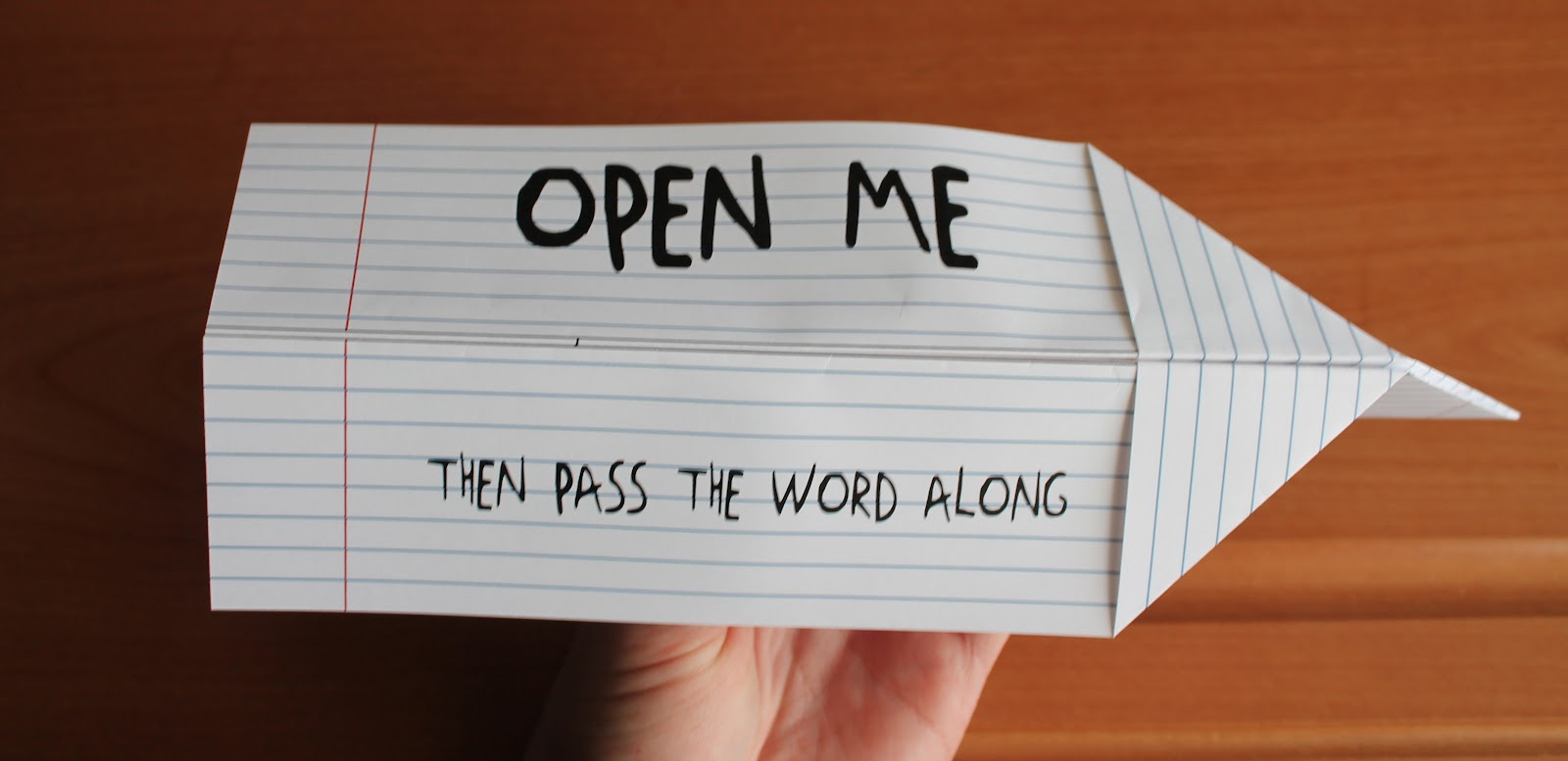
The photographs above display a flyer for the Air Zoo which is an actual Aviation Museum. The target market for this flyer was children and to make it interactive (making the flyer actually fly). For the target market I chose to create a simple design so it would be suitable for children. My goal was to design an easy to make airplane that resembled the notes kids would pass to each other back in elementary school. I didn't display any information on the outside of the flyer that would give away the "secret" of what was inside, so it would make the viewer more curious to look at what was inside. I created a paper-like style to the outside of the plane, but I abstracted it so it wouldn't look exactly just like a piece of paper.


This poster design was created for my Color & Composition class. This is a poster ad design of a concert held by Eric Church which is an actual concert that is happening tonight at the Kellogg Arena. During the critique I was told that this definitely represents country, but the style is a bit timid for Eric Church. Personally I think this works for a majority of his songs, but I should have something different because I reference the song "Drink In My Hand" for the class which gave him more of a "hardcore bad ass" approach. I just picked that song because its one of my favorites as of recently and I had not considered the relation between the poster and the song. I should have presented "A Lot of Boot Left to Fill", "Love Your Love the Most", etc. I guess ya live and learn haha. Oh and I created everything in this picture including the photograph which was taken in Mt. Pleasant, MI.


This is a letter head, business card, and envelope of a fake company that my professor gave us. Below is the scenario:

"Sixteen years ago a few friends in Minneapolis MN decided to open up a music instrument store, specializing vintage rock guitars. The named the store “Frets”. The first year of business was deadly slow, they barley broke even, but after a few years it started to explode. And soon they were expanding. Now they have ten stores and are looking to add three more. With this expansion they need an updated look and feel. You have been hired to create a new logo, and apply that to business cards, letterheads and envelopes."


*All photographs were taken in Mt. Pleasant, MI

These Photographs above are called Diptychs. Which are two photographs displayed side by side that relate to one another. My teacher made us draw a topic and we had to go out into the world and create diptychs that related to the topics we drew. The topic I drew was "change", so I had a little fun with it. I ended up choosing the first photograph because I thought it would be fun to use the topic literally and metaphorically. The photo is literally change, but it contains a metaphor of change over time from segregation into integration of our society. The nickels, dimes, quarters represent Caucasian's and the pennies represent African Americans (whites & blacks). I flipped the top picture upside down to give the impression as if the change would fall into the picture below creating the circular world-like shape of integrated change.


The pictures above are from the Photography 140 project that I'm currently working on. The objective for this project is to capture movement using light art and freezing images. These are a few images that I liked, but I have to redo most of the others this weekend.


Above was a presentation that was happening in the art building during my photography class and we had the opportunity to check it out. From what I was told, the class was melting metal. This gave me a good opportunity to add a few extra photos to my capturing movement project.


I feel that my projects turned out well. I am continuing to work on my presentation skills so I can give a better sell to my designs. Its a work in progress, but I am starting to get better as time continues on.

That is all for now. Have an awesome spring break everyone!