I have some awesome news! I was actually part of an article in the CM-Life newspaper involving my Design Bureau class! The article covers how we get to work with real clients in a classroom setting. Personally, I am working with three clients Solar Cycle Lights, Moore Hall TV, and New Central 34. Read the full article by following the link below.
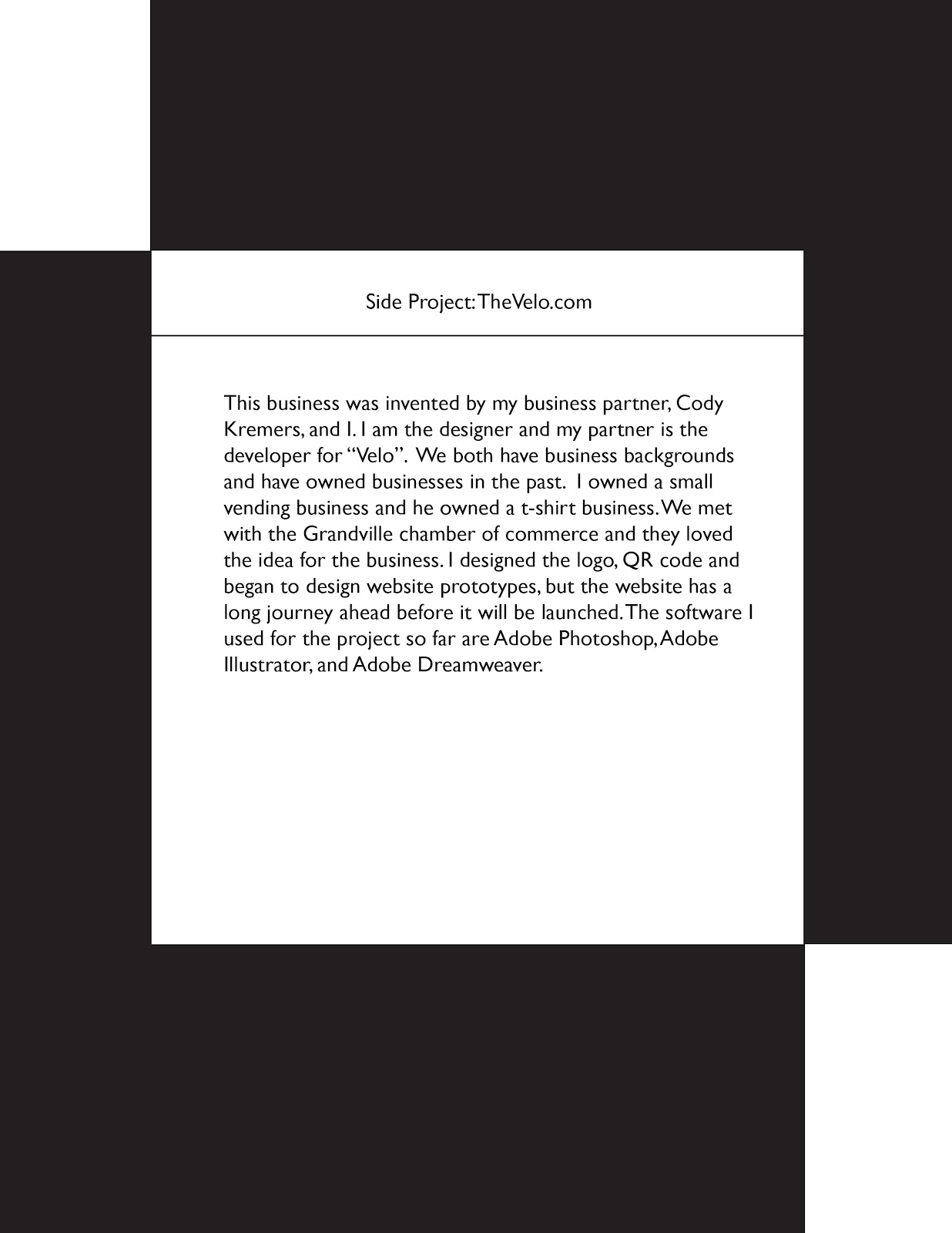
Recently I decided to take some time to revise the Velo logo. This logo is for a business idea that I have in store, but still have a long way to go with building my web development skills before this business can move forward.
Below is a logo I worked on to show my appreciation of small businesses. This idea of #heartsmallbiz is a focus on the importance of small businesses being recognized in a local community. We are losing a sense of community with all of the corporate businesses leeching the profits and the entire idea of community away from the people. I hope to create an online community that will counteract this and give strength back into the idea of small businesses throughout our nation. You can show your love for small business by following the brand new Twitter account Heart Small Biz.
I also participated in a St. Patrick's day t-shirt contest for my Design Herd group. The idea was appropriated from the Lucky Charm's character with a couple mug's of beer in his hands to celebrate the Holiday.
In my Advanced Typography class we were assigned a unique assignment where we had to construct 3D type. The assignment was so broad that students have been scrambling to narrow down there ideas to one thing. One night I was at the library and happened to have my camera on me and the idea of creating the word "Face" out of library books would be a brilliant idea. I then went a step further and used books that only involved social media and the internet to give confused viewers an extra hint.
A few graphic design professionals came to CMU recently to speak to the designers on how to attract business, making the transition from school, building a portfolio, and considering making an online portfolio to increase exposure. Once I hone in my skills I will have a website up and running.
As for the latest news, I applied for a graphic design internship in LA through an internship program called "Dream Careers". The tuition is steep, but they provide you everything all inclusive. This includes housing, commuting to work, meals, facilities, speaking events, and other events. Everything is located at the UCLA campus and as a student of the program you are allowed to have access to the UCLA facilities. It also provides school credits and a 100% guarantee for an internship of your choice with some of the top companies like (Yahoo, MTV, Millennium Films, etc). They also provide other internships throughout the U.S. and even outside of the U.S. as well. I decided to apply to the LA program because it seemed to be the most suitable to my interests as a graphic designer. Working for an entertainment agency would literally be a nice taste of a dream career. So if you are interested in finding an internship that is catered to you, the ability to network with other interns, and make your experience more accommodating to the transition into a real life work situation then this might be a great opportunity to check out. The website to get there is is summerinternships.com.
If you are a student graphic designer and have any questions about building a portfolio, how to get into the graphic design program at your school, networking, finding tutorial websites, specific questions about my projects, or any other general advice I would gladly help you out. Please leave comments and suggestions as well because I will be happy to hear your advice as I continue this journey on the Path2Design.
The spring semester at CMU has begin and this marks the first semester that I have been able to take classes that are only allowed for students who have been accepted into the program. The classes on my schedule are:
- Intro to Western Art II
- Aesthetics
- Introduction to Graphic Arts
- Design Bureau*
- Advanced Typography*
The classes with the (*) are the Graphic Design major only classes. The introduction to Graphic Arts is for my Media, Design, Production, and Technology minor, but I think it will have some similarities to the Intro to Graphic Design class that I completed three semesters ago.
Design Bureau is going to be my favorite class because this class consists of dealing with actual clients. My professor is organizing our clients and then depending on how many clients we have, we will be split into groups or work individually. When conversing with my peers, there apparently have been some horror stories in the past with clients that have been very disobedient, ungrateful, and ultimately problematic. I see this as just being part of the challenge and it is simply business. The edge I have in this situation is that I was originally a business major so I have background knowledge on how to orchestrate a business meeting. I was also a salesman for Sears and for Cutco which has its extra benefits.
In this class the required textbook is "How to be a graphic designer, without losing your soul" by Adrian Shaughnessy.
I began reading this book today and I am already excited about sharing it with you.
Another book that I have been reading and would like to recommend to you is called "Logo Design Love" by David Airey. The title of the book is a giveaway, it obviously about logos, but it will give you an insight for any of you logo lovers out there or for those who wish to become one.
Advanced Typography will be a fun, but challenging class because of its intensity with type usage. I have often noticed that it has been tough to find a certain type choice for a specific project with a plethora of type options available. As I have been told, I will eventually figure out my favorite typefaces to apply to my style of design.
One of my major struggles is finding my style. I know that when you think of a specific designer or artist you will know their certain style. When I think of myself, I have no style to identify with but I'd rather learn everything I can because I do not want to be limited. This ideology of wanting to learn it all limits the ability to fine tune a specific style because the time consumed by other styles interfere with expanded my knowledge on the other. I think this is the point where a lot of college students are at, which is the stage of experimentation.
Learning all of these new things are exciting, but they are also overwhelming when you are trying to learn them all at once. This semester I am going to apply a tactic that I have learned from a couple of motivational speakers that I have been listening to on my iPad. I learned the tactic of goal setting in a unique way. Instead of cramming all of my goals together, getting overwhelmed, and then ending up getting rarely anything done, I am going set individual goals one at a time. I will not move forward to the next goal until I have mastered the previous goal (this only applies to projects outside of school work). Once everything is ironed out between school and side projects with this new goal setting routine, then this semester should be smooth sailing.
If you're a Graphic Design student and you are reading this, one tip I can give to you is don't be limited by what your professors teach you in school. Go out and learn everything you can on your own. You will learn so much more in addition to what you learn in school. Just don't get overwhelmed by it and learn at your own pace. I guess I'll add an additional tip. This world is becoming more and more interconnected so learn skills other than just graphic design because that will give you the edge against the competition and may be required for your jobs in the future.
I had forgotten to say that I finally got accepted into the graphic design program at Central Michigan University! Next semester I am officially taking a few classes that only Graphic Design majors are allowed to take. I'm very excited and am looking forward to acquiring new skills to become a professional graphic designer. Along with that, I am also pursuing the MDPT (Media, Design, Production, and Technology) minor. Aside from enjoying learning to build websites in CPS 165 and learning Adobe Flash in CPS 282, I am taking those classes for the minor.
I would really like to find and internship this summer to get a feel of what it's like to be a design professional, so if you know of any companies that are looking for help with graphic design please let me know!
There is so much to tell you! But before I do I just want to say something in addition to the title that you read above. Even though there may be no brakes in the car of life, as long as you hold your head high, the road will continue on so you will never crash and burn. Enough with the motivational speech and time to catch you up. Where have I been since mid-September you may be asking? Well, I have been attached at the hip with my laptop because I decided at the last minute that I was going to build my Graphic Design portfolio for this semester rather than in the spring. I finally completed it on Monday and turned it in on Tuesday which was only one day before the deadline. I have been so busy that I haven't even had time to manage my fantasy football team. I feel like I'm letting those guys down! All kidding aside, it really has been crunch time lately between the projects, exams, homework, quizzes, and a majority of the time devoted to building my portfolio.
The contents required for my Graphic Design portfolio for the Central Michigan University Graphic Design program:
*A written form showing the grades I had in a few Art classes and included my signature
*One page essay of the reason why I wanted to become a Graphic Designer
*10 projects
*10 descriptions
Brownie Points (hopefully):
*Added a cover on the front of my portfolio that matched that basic design for the descriptions
*Laminated every page to give it a professional look
* For some of the designs I provided thumbnails for an easier viewing and to make my project flow more smoothly
Below is my portfolio from cover to finish:
That completes my portfolio! I hope you like it! I had to leave a couple parts of it out, but it shows all ten of my designs that I submitted for the program. Wish me luck!
This next piece below is one from my typography class. I decided to design the Ray Ban wayfarer sunglasses out of type. All of the type inside the image is about the history of the Ray Ban company and how it has been a significant part of our society's style for many years.
This piece below was created for my Art 117 (Intro to Contemporary Issues) class. It was created to match the similar style of David Hockney. It displays the style use of time and motion to represent what the human eye experiences in an event over a period of time. This particular project was created to represent a night of fun between college friends and capture the energy throughout the night.
Below are a few logos that I am working on for my personal logo. These are for my Logo & Identity course where I have to create a business card, letterhead and envelop. If you have any suggestions I'm open to hearing any of them.
Well there you have it! These project are what I have been devoting the first portion of my semester to. Feel free to comment and share your knowledge with me to help me in the process of becoming a Graphic Designer. That also goes both ways, I'd be happy to help you if you are need of any advice on project ideas too.
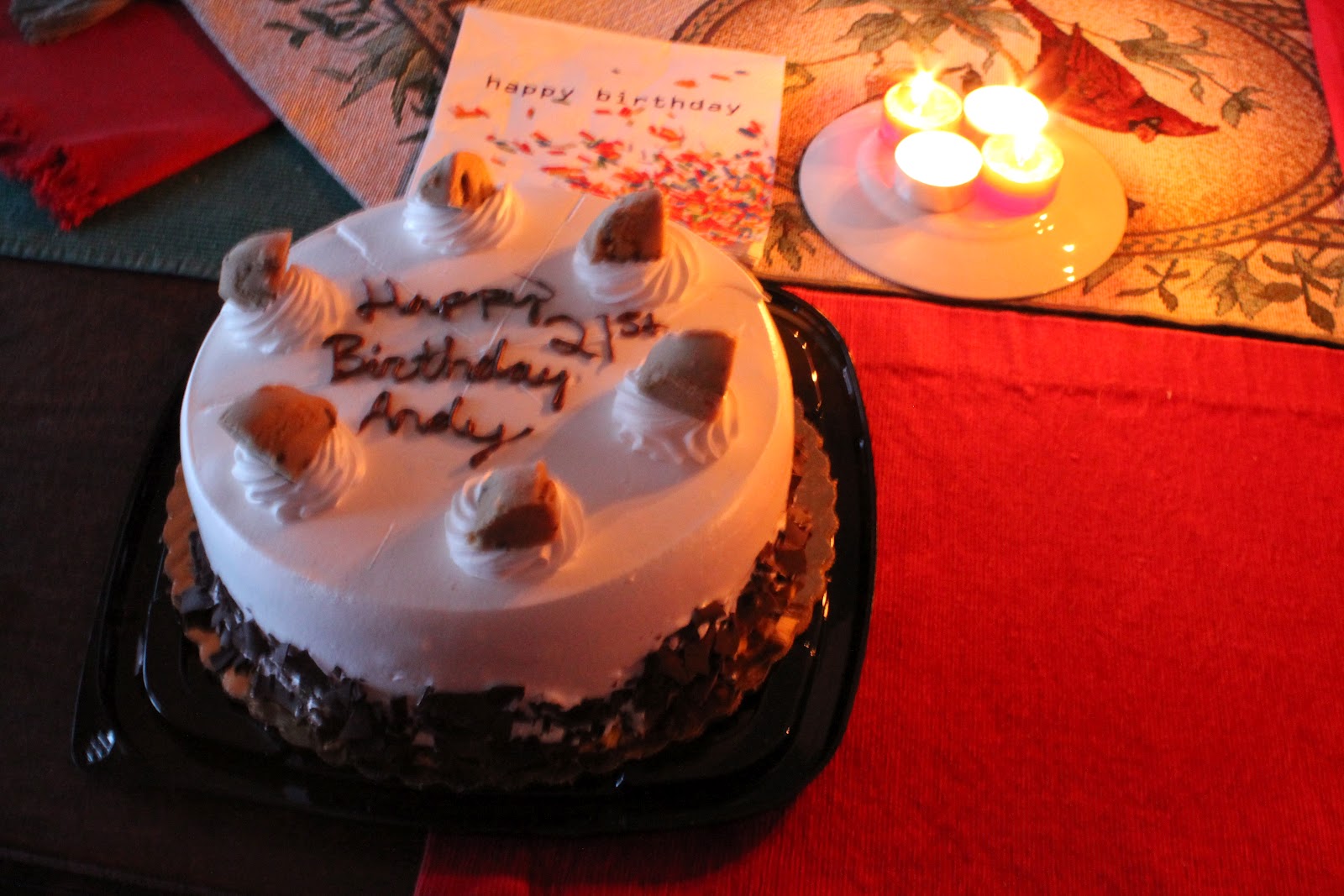
Whew! I survived my 21st birthday last Tuesday, but I may have had a little bit too much to drink during my birthday celebration... But a 21st birthday only comes once! I still managed to get all of my homework done and get caught up with my classes, but I really need to establish a better system because I have been very forgetful lately. I have been so overwhelmed with learning new techniques for graphic design and photography that I have been forgetting small things left and right which could add up in the end. I think I'm going to buy a heavy duty planner that can fit a lot of information in it so I will be able to fit lists of things to do in it. I'm really trying to turn my performance around this semester especially because I am finally enjoying the classes I'm taking.
I have completed a few big projects since my last post and they have been very time consuming. I almost considered avoiding going out for my 21st birthday all together, but I ended up getting suckered into it. The main reason why these projects were so time consuming is because I couldn't successfully finish my project without changing something or changing it entirely to make it better. Sadly, I missed the turn in date this afternoon because I wanted to brighten up my poster picture and eliminate the white cloud specs that were distracting the image. I had all of the supplies, had my poster cut, foam board cut, and it was ready to be pasted on the board two days ago, but I decided to change it last night and the only place I could print an 11x17 poster was in the computer lab which was filled with classes until mine began. As a result I will be getting marked down on Monday. I just hope this doesn't continue because I am really trying hard to get my grade back up to a 3.0 or higher so I can apply for the summer Graphic Design internship through Disney. I believe I have the creativity to become a great graphic designer.
As for the projects I completed were a wire moose, multiple graphic design posters, a new Facebook cover design, I started a poster project for my cousin Liz Heys, and two Photography projects completed.
The wire moose I spent easily 3 days completing the project with minimal sleep in between. It was pretty much eat, sleep, moose from Friday January 20 - Sunday January 21. My goal was to have it be completely filled, but I had already spent over $30 extra on the additional wire and it was getting too costly. I'll likely finish the moose in the future, but it looked pretty good as it was in my opinion. My teacher came up with a creative idea about potentially adding a small motor inside the moose that made the antlers move from side to side. That would be pretty awesome if I could make that happen, but it would be a tough addition. The moose ended up being about 3 ft by 3 feet (from toe to antler)
The Moose:
The graphic design poster took up most of my time which I figured they likely would have, but I didn't expect making multiple posters having completed them and then deciding to change my ideas at the last minute. I assume this will come into play while in the field as well so it was good experience learning to make multiple completed poster ideas and having options to choose from even though all of the extra work will bring my grade down since it will be late.. Catch 22 right there I guess.
The posters:
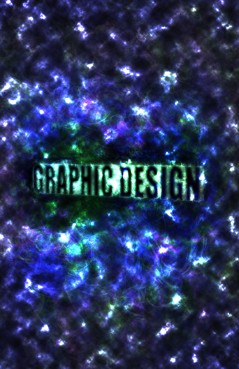
This poster was my first creation. I actually really enjoy this one. With a few more modifications I think it could have turned out great. I was intending on creating a more space like feel contrasting white and black and then I made star-like shapes us different colors, opacity, and size. Below I was messing around with paint brushes and opacity and I thought it came out awesome. It gives off a sort of glow and the brush strokes remind me of cells within the body which I think it gave it a cool addition.
My intention for this poster was to show nature and the world giving a statement that our world is filled with color, but during the critique in class I was told that the background was too distracting and people thought that it gave off the "textbook" kind of look to it. I completely agree now that I look at it and it made me laugh. I really like the logo I made for (Graphic Design Central Michigan University) because it seems to flow and drag the eye down in a stair-like fashion, so I might create my own side project with the logo just for fun. I've been playing this game called Words with Friends a lot lately and I'm pretty sure I derived my idea from playing that on a daily basis.
This third poster didn't get very far into development and I decided to just scrap it. I was intending on giving the literal meaning of design for the background, but it just didn't seem to work for me.
This next poster I put a lot of thought into. I wanted to show a world without design and then a world beneath to show what design adds to the world. I ended up deciding that this poster was too plain, but yet again simplicity can also be a good thing. After a couple of days I decided I couldn't stick with it because I wanted to create something that was complex and creative.
For my final project I first began with the text. I followed a tutorial to help me create the 3D text with the glowing blue and green flares coming off of it to give it a unique effect.
First I rendered clouds with one pink and one blue overlay and then I used an abstract paintbrush throughout.
Next I tried flipping the pink overlay on top of the blue.
Then I tried making a more darker grunge kind of look to it which I truly liked.
I felt the center was just too empty so I added a few brush marks.
I then decided that it would be cool to add this 3D text into my original poster and see what it looked like. I really like it but the image didn't really pop out like I wanted.
I then went back to the blue and pink style because it made a good contrast with the bluish-green logo to help make it pop out for the viewer.
I decided that I needed to get rid of the spottiness of the clouds because it was taking away from the focus of the main element in the middle. Then I added a picture from a nude beach I walked by in Miami Haulover, Beach and edited it to make a fun statement rather than its traditional statement (ATTENTION BEYOND THIS POINT YOU MAY ENCOUNTER NUDE BATHERS). I was hoping that people would get a kick out of the addition of the altered sign especially with the actual hidden meaning behind it. I then completed the poster by adding the CMU logo, the website, and contact number.
The next project I worked on was for my Facebook cover image. I was tired of using images created by other people especially now that I have the ability of creating my own finally :). I used these color combinations because I wanted to give off the impression of the ocean under a setting sun because if I had the opportunity I would live ocean-side and be completely content.
I thought the jellyfish took away from the logo so I got rid of it and added and abstract feel to it with a graininess to add texture to the image. Finally I added my website below so people can check it out.
*Note these next 5 designs below came from someone else's poster project because we did an in class alteration project. The guy that made this design originally had a bright green grid and bright green words to follow the images. Our assignment was for each of us students to switch computers and alter someone else's final poster project 5 times and below are my creations.
For the first three I decided that it would make sense to use the internal colors of the smart object (the triangular forms) to add a kind of flow throughout the images.
With these two I rendered clouds to overlay the poster and changed the colors. I also changed the smart object to give it a shadow and more of a shine on the one to the left. On the right I gave it more of a crisp shadow, but I took out the bevel emboss and lightened the opacity to give the object a more transparent look. I'd really like to learn how he created those smart objects so I can create some projects of my own.
This image I took at around 4 in the morning a couple of days ago because I originally started out with and photo from a point and shoot which looked really dull and didn't have many details. In the color image I clearly had shadows under my eyes, so I lightened it up in the B&W version of it. Okay enough rambling, I used this photo for a project in my Color and Composition class where we had to use Adobe Illustrator and create a Live Trace of the image and then we used Live Paint to fill the image. The colors schemes we could use varied from analogous, complementary, split complementary, etc. For this first one I chose complementary colors. The reason it isn't just two colors is because we were allowed to use shades of that particular color. I chose blue and orange because the are my favorite and happen to be complementary to each other.
Below are some images from my Intro to Photography class. These photos are from two separate projects. In each project I had to shoot thirty photos, but I picked my favorites to show you. The first project was to pick a object and shoot 30 different photos of it to give you a sense of the different angles and views you can create from just one scene.
This next project was to find short and long depth of field images. Depth of field is the difference between the nearest and furthest objects. A short depth of field is where the object is in focus in the frontal portion of the photo and the background is blurred while a long depth of field captures the entire image in focus. We used a setting which is Aperture Priority or (Av) on my Canon DSLR. I'll be honest, I had a very tough time with the settings when I went to shoot the images. Mainly it was because I chose to shoot my photos late at night so I wouldn't interrupt people in the mail room, club house, and the fitness center. I didn't know until the day after I shot the photos that I needed to have a lower aperture (meaning it would allow more light into the camera), so I tried to recover my images through Photoshop> Adobe Bridge> Camera Raw to get rid of the noise and brighten the image a bit. I ended up editing every single picture I had taken, which took quite a few hours to complete. Unfortunately the color contrasts are different from my PC compared to the Mac computers we used, so the photos came out to being a lot more yellow than I had imagined. But all in all, I am learning even though I may be a little slower at it than the rest of my class.
As for this weekend, I have no projects due besides the Live Trace/Live Paint project that I showed you above. I have a few projects due later in the month. One project will be a research paper on Paul Rand who is a very famous logo designer (abc, UPS, IBM, etc.). He bases his designs on simplicity which I really need to learn because I always want to add more and more. I haven't developed a mindset to just keep things simple because simple can be more effective in many cases. My new project I am starting in my Graphic Design class is a letterhead, envelope, and business card design. This one will be fun to work with because we have two options that are already set up for us which is a instrument shop specializing in guitars or a muffin shop. In my 3D Design class we will be working on a project that uses repetition, so I was considering creating a project that follows the Amway pyramid scheme using dollar signs in a pyramid formation. In the rest of my classes I need to catch up on all of the readings, so I'll be in the library all day tomorrow. I'm making this weekend purely a work weekend so I can get caught up. I didn't do too well on my first couple quizzes in my class, so I'm going to start making flash cards for all of these various terms that I'm learning each day. Its too overwhelming to try and remember them from just reading.
There is one more thing I would like to add. I got a Graphics Tablet from my parents for my birthday! Its a Wacom Intuos4 wireless tablet. I am so happy that I got this because this will greatly help me with my projects now and in the future.
I hope you enjoyed this post and I would be grateful for any suggestions or comments. If you have any questions whether its about my projects or any general questions then please do so. I'll be happy to answer them.








.JPG)
.jpg)
.JPG)
.JPG)
.JPG)
.JPG)
.JPG)
.JPG)
.JPG)
.JPG)
.JPG)